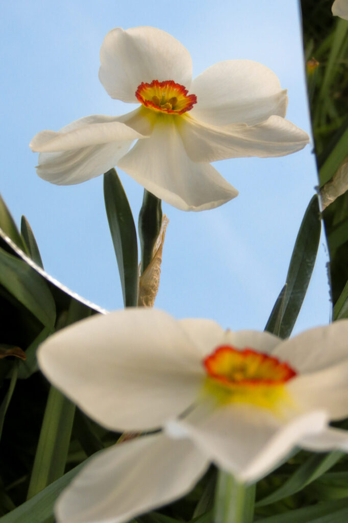
The sun is shining much more of late and blessing us all with its warmth and flower-nurturing properties. With the arrival of increased sunlight is the surge in blossoming and flowering of much of our plant life. I have felt really uplifted of late just by noticing and taking time to enjoy tulips, cherry blossom, wildflowers and bluebells whilst I have been out and about.
As the sunshine nurtures the flowers, the flowers then nurture much of our insect population. I have already seen several butterfly species fluttering from one flowerbed to the next. All of these lovely things that follow the arrival of summer bring much colour to the forefront of our environment and natural surroundings. This got me thinking about the effect of colour on our mood and wellbeing. The official term for the study of such things is called colour psychology.
Colour psychology is the study of colour’s impact on our behaviour. It aims to gain an understanding of how different hues can impact our feelings, behaviour and decision-making processes. Colour psychology is used in many different fields, including marketing, graphics, interior design, art and more. The effects of colour on people can vary for each individual, depending on factors like culture, upbringing, age, etc.
Although, some colour meanings are more universal to most of us. For example, we tend to naturally associate warmer colours like red and orange to warmth, heat and sunshine. On the other hand, cooler colours like blue, green and purple can be said to be calming and refreshing.
With this in mind for this month’s Calmly Create session I plan to introduce the idea of colour psychology by painting large wooden butterflies. I will encourage group members to paint their butterfly in colours that will have a positive impact on their mood. This may vary with individual choice and preference but the following is some information I came across which outlines some of the psychological theories associated with some colours:
Blue colour psychology: Blue is generally seen as reflecting loyalty and stability. It’s also often connected to feelings of tranquillity, harmony and calmness, reminding us of the sea and sky.
Green colour psychology: The colour green is widely associated with nature. In colour psychology, it’s also often used to symbolise ecology and sustainability, making it a popular choice among brands that want to appear and promote themselves as environmentally friendly.
Yellow colour psychology: Along with symbolising caution, yellow can also be associated with optimism, sunshine and warmth. These positive connotations are prevalent around the world and among many cultures.
Red colour psychology: Different cultures around the globe perceive red in varying ways. For example, in China’s stock markets, the colour red is used to symbolise a price increase, whereas the extreme opposite (the stock going down in price) holds true in many other countries. This is because red is a lucky colour in Chinese culture, also used for bride’s wedding dresses and to symbolise celebration and fertility. Red’s bold and powerful presence also makes it the colour of choice for many iconic brands, like Coca-Cola and more recently, Netflix.
Orange colour psychology: Named after the fruit, the colour naturally provokes a sense of freshness. Falling under the category of warm colours, it also emits a feeling of heat and summer, while its darker tones are often associated with autumn.
I look forward to seeing the array of colour use and resulting spectrum of butterfly designs in the session. I encourage you all to take note of the colour explosion in the natural world following the arrival of the summer sun and notice how it makes you feel.
Happy Creating!
Ruth x x x
Source: https://www.wix.com/blog/creative/amp/2020/01/color-psychology?utm_source=google&utm_medium=cpc&utm_campaign=9852964004^140722897092&experiment_id=^^593893309562^^_DSA&gclid=CjwKCAjw0dKXBhBPEiwA2bmObRKNJC1pW7NmVS2-hRkbO4RD8lwsPrRC6eaQOtrWAVNrw6Kh2INrEBoC1zgQAvD_BwE
Image Credit: Amy Hall (header) and Ciara Tweedale (in-text)